
Objective
Compose a non-literal visual and typographic interpretive sequence with content derived from a traditional three line Japanese haiku poem.
Integrate type, graphic elements and image, emphasizing simplicity, intensity and directness.
Haiku Selection
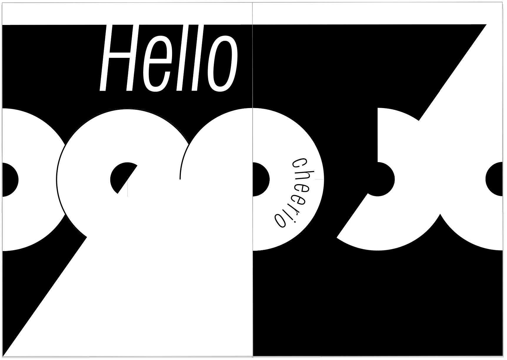
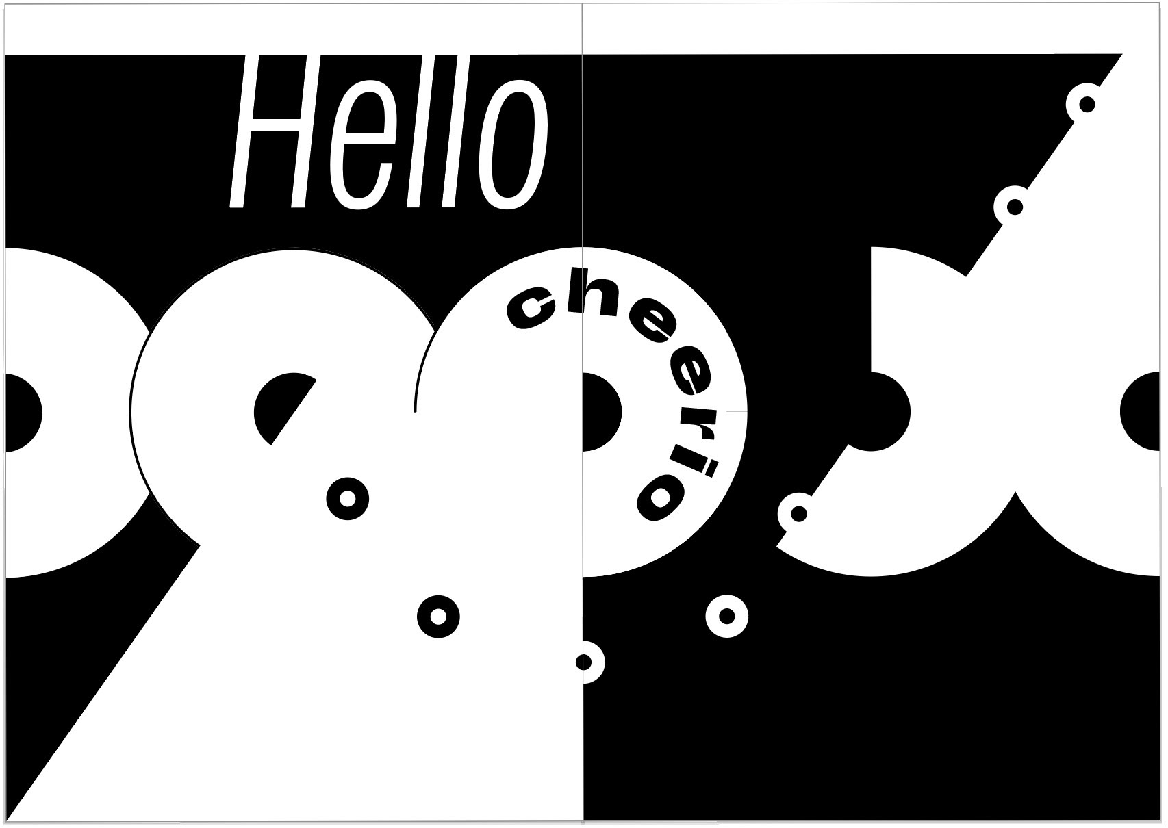
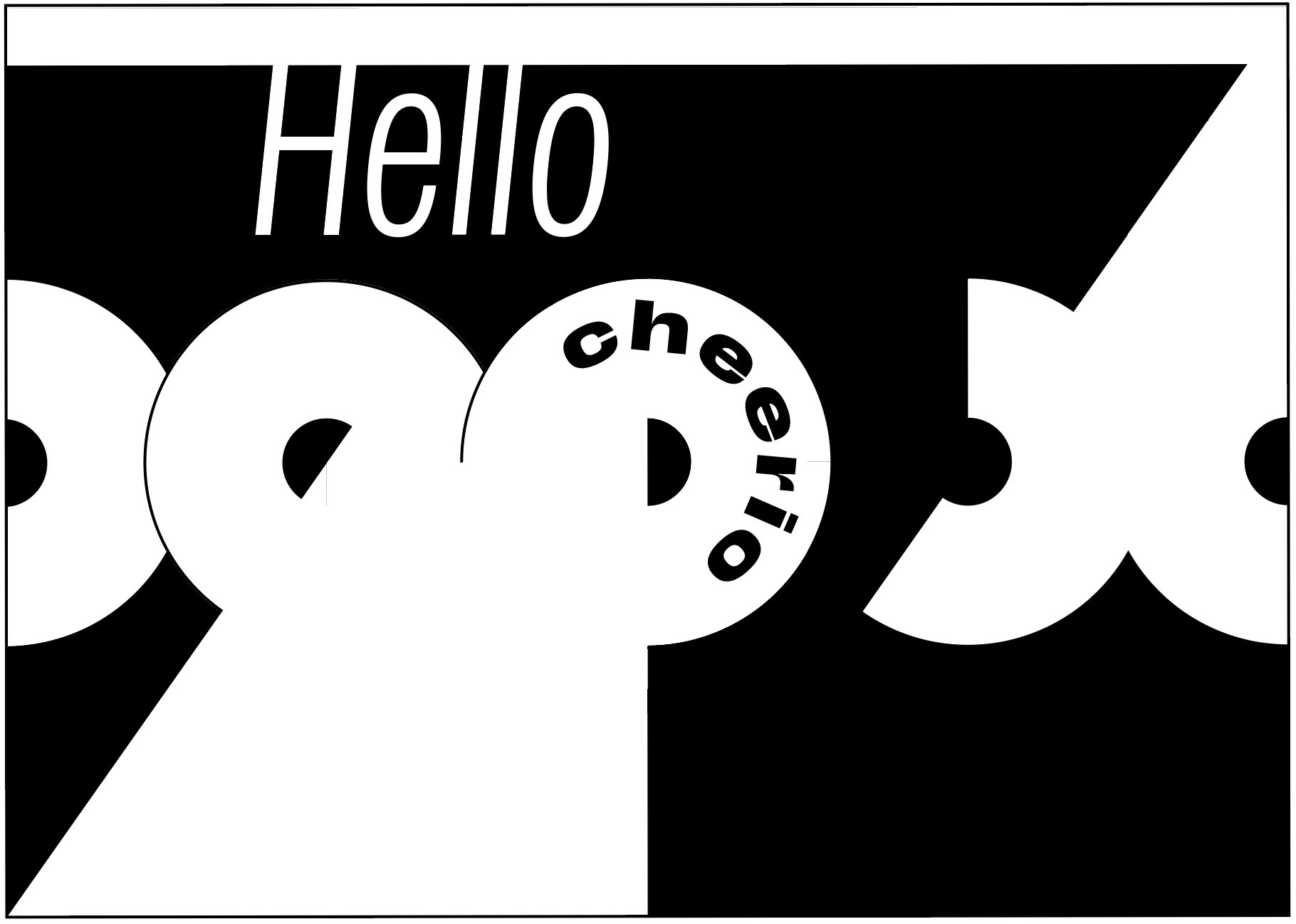
Hello Cheerio
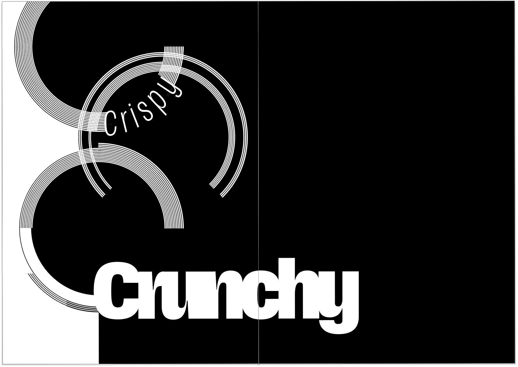
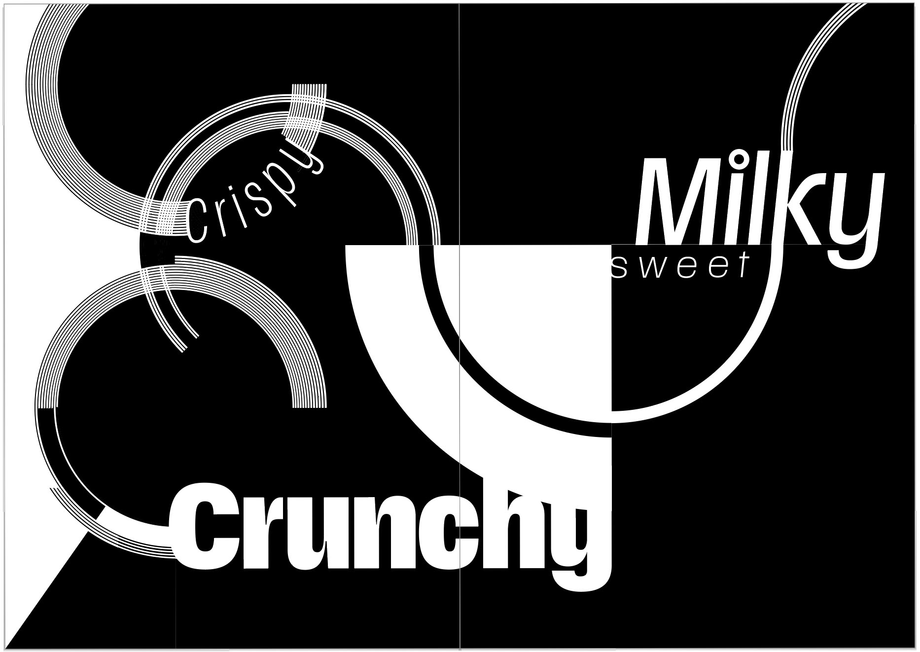
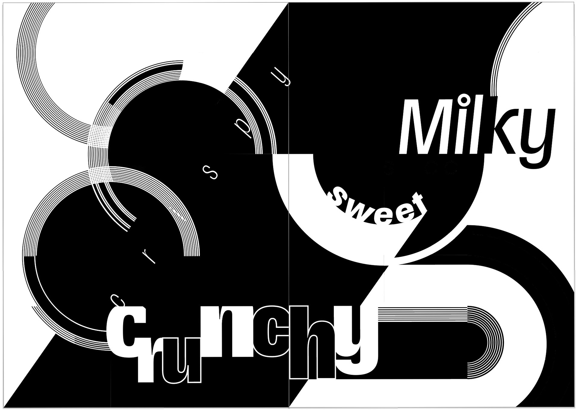
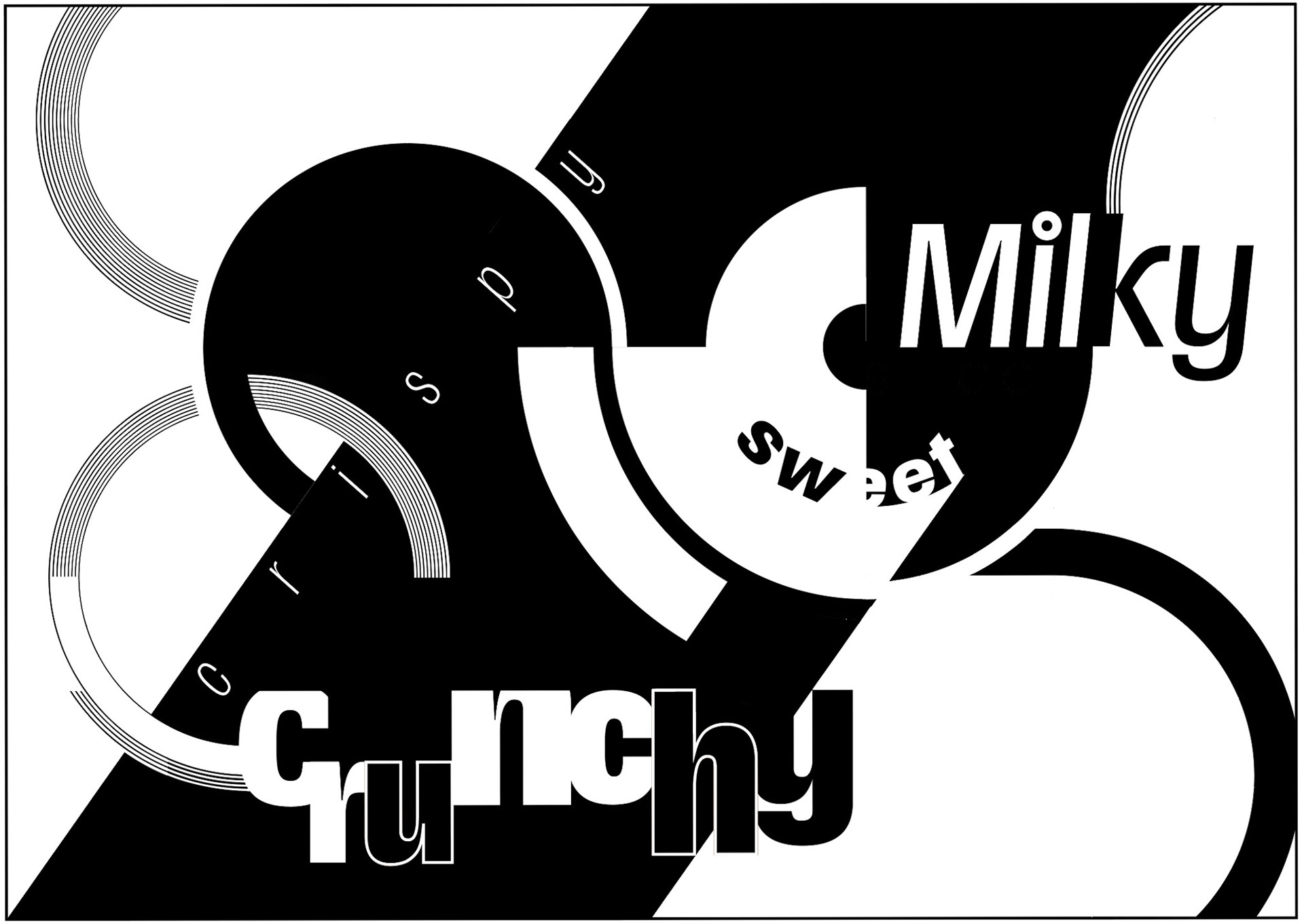
Crispy, Crunchy Milky, Sweet
Morning Fantasy
- Maya Solganik
Typeface Selection
To represent the dynamic nature of cereal (crispy, crunchy, sweet) I researched variable typefaces, ultimately experimenting with Scale Variable and Redaction.
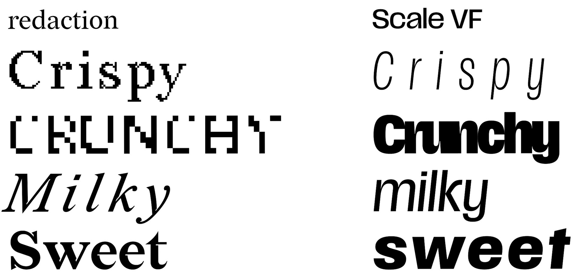
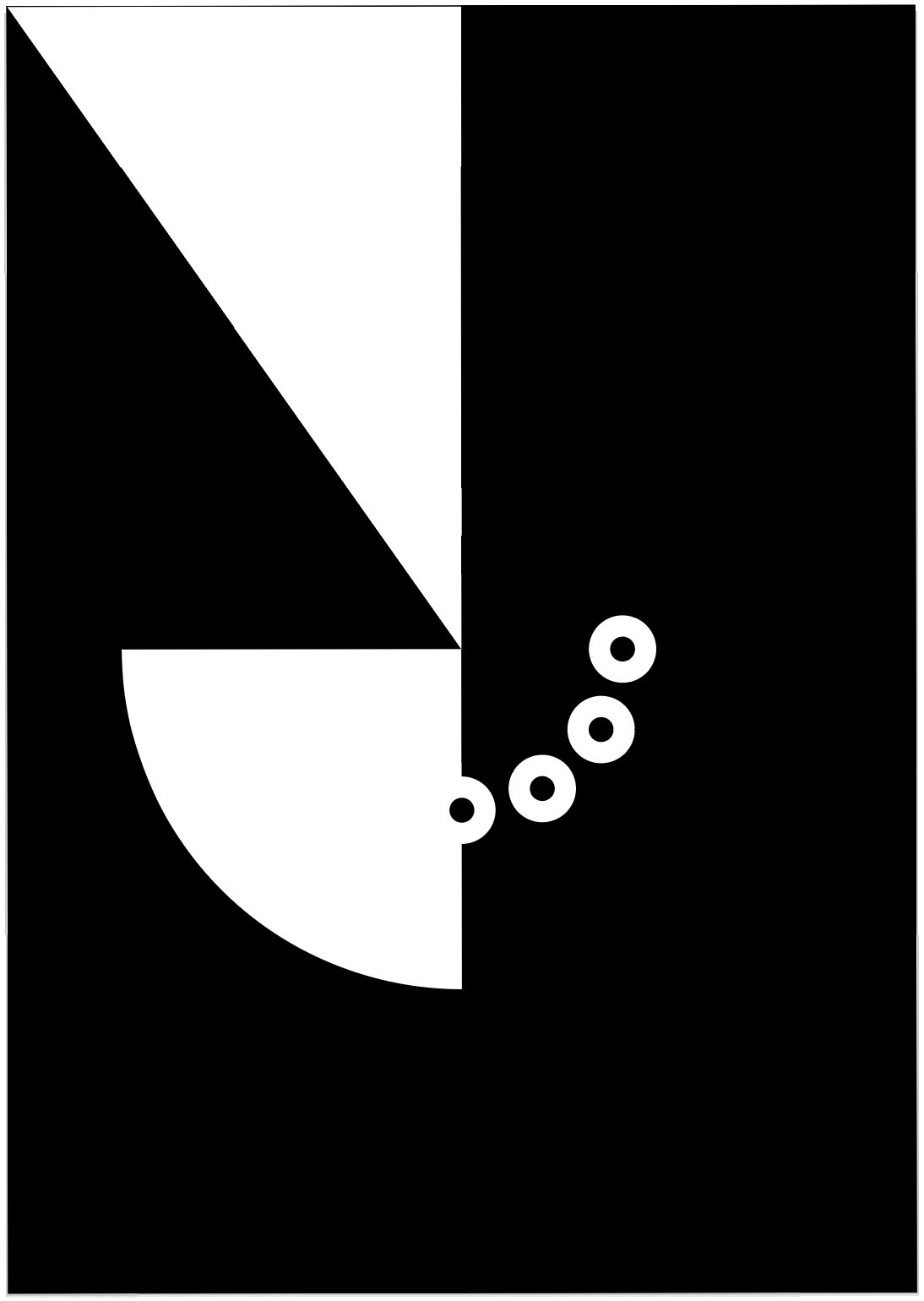
Scale Variable's curvature better emulated the cheerio shape motif I planned to incorporate into the booklets design.
Layout Design
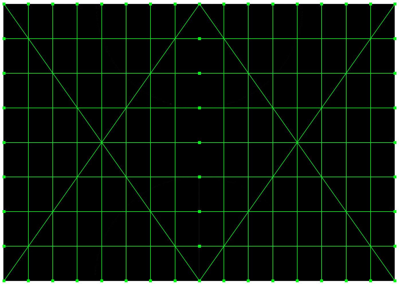
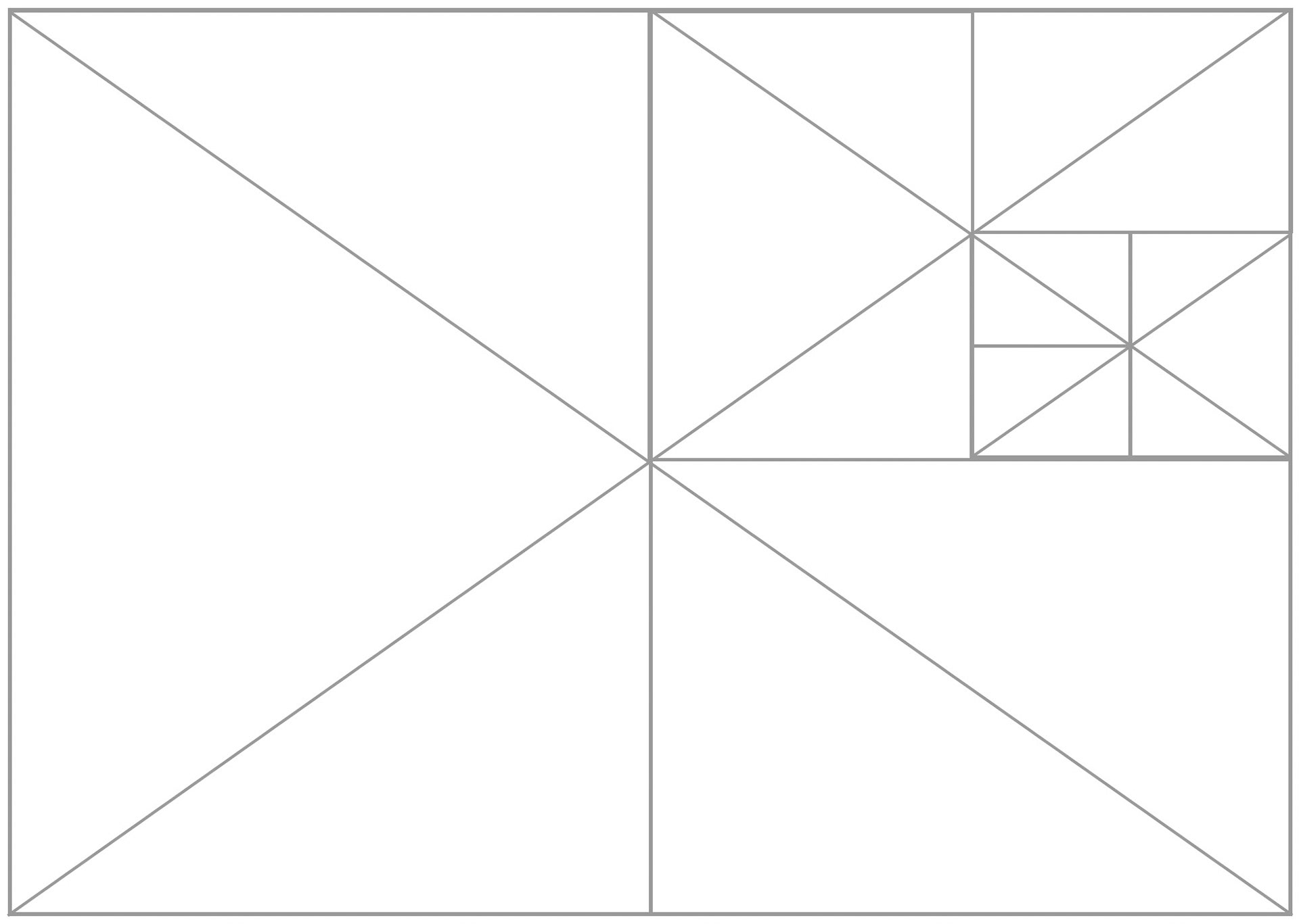
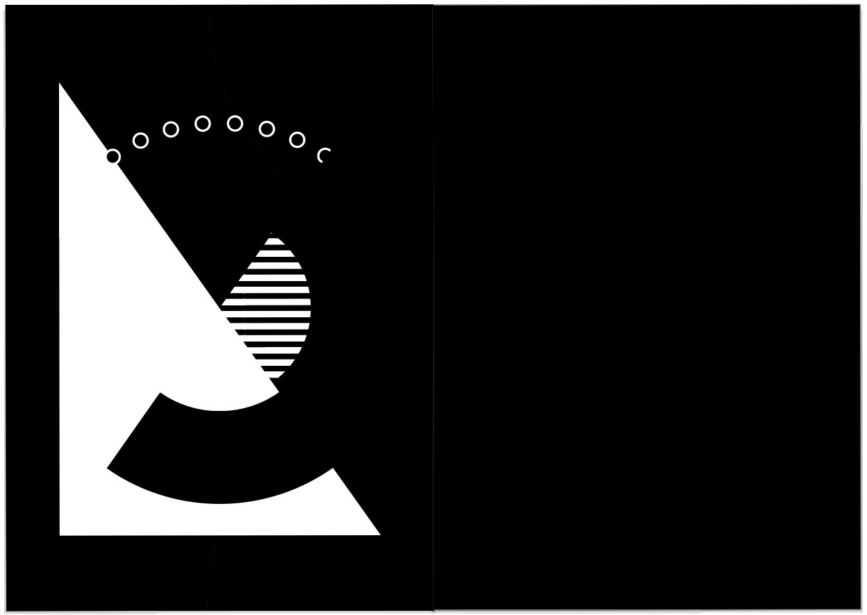
I began each page layout with a root 2 grid to create uniform structure across the entire design.
Composition and Type Design Process



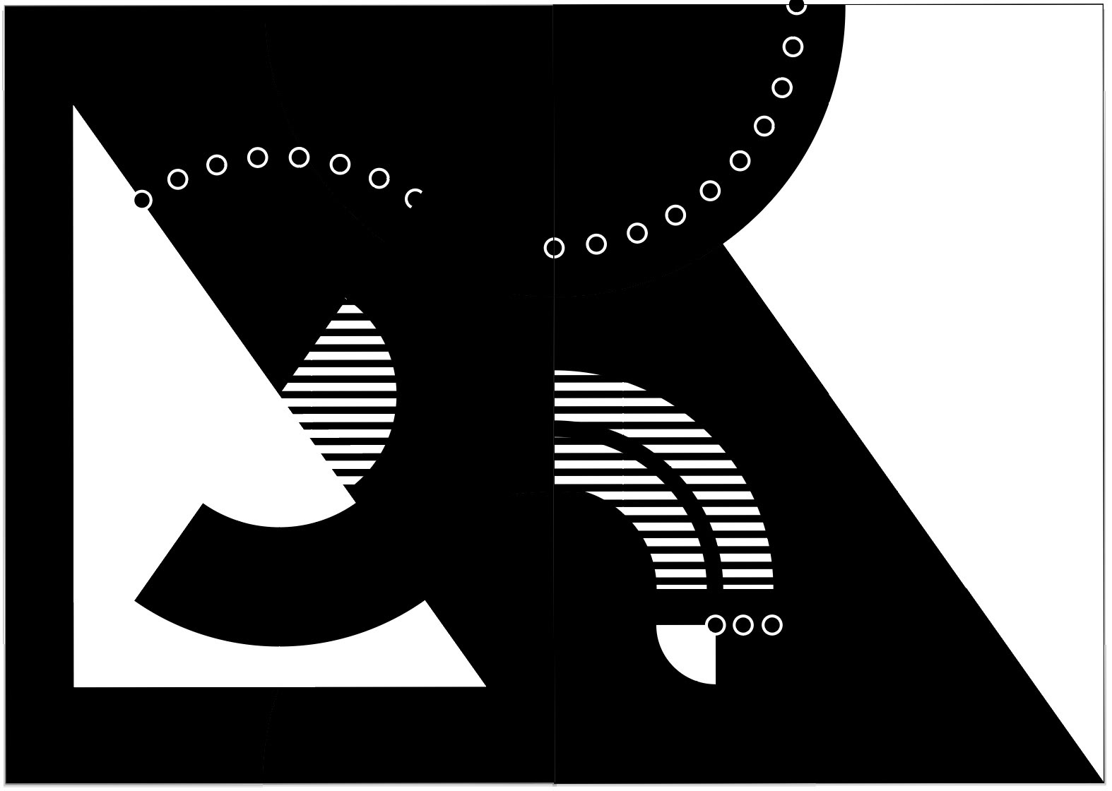

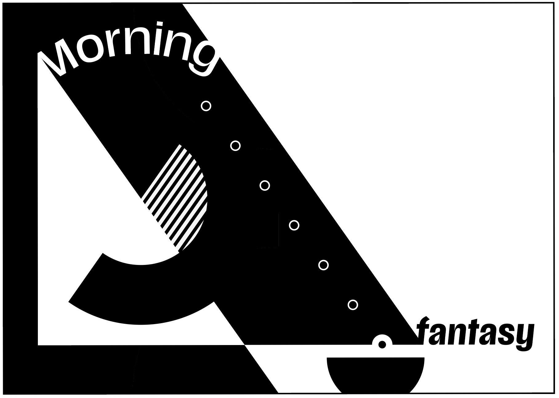

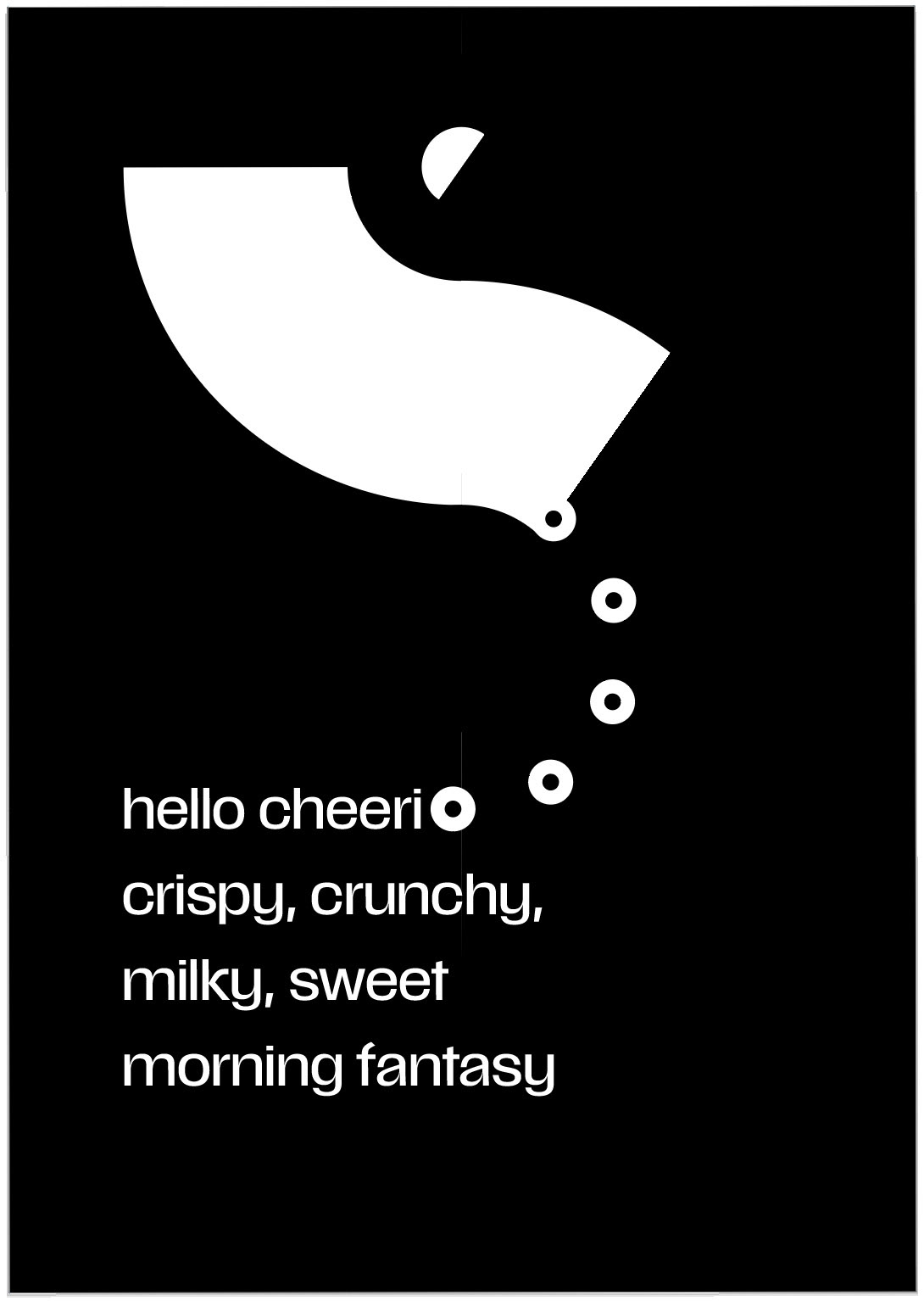
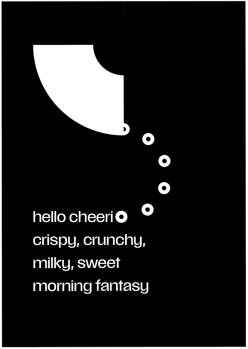
Color Palette Exploration
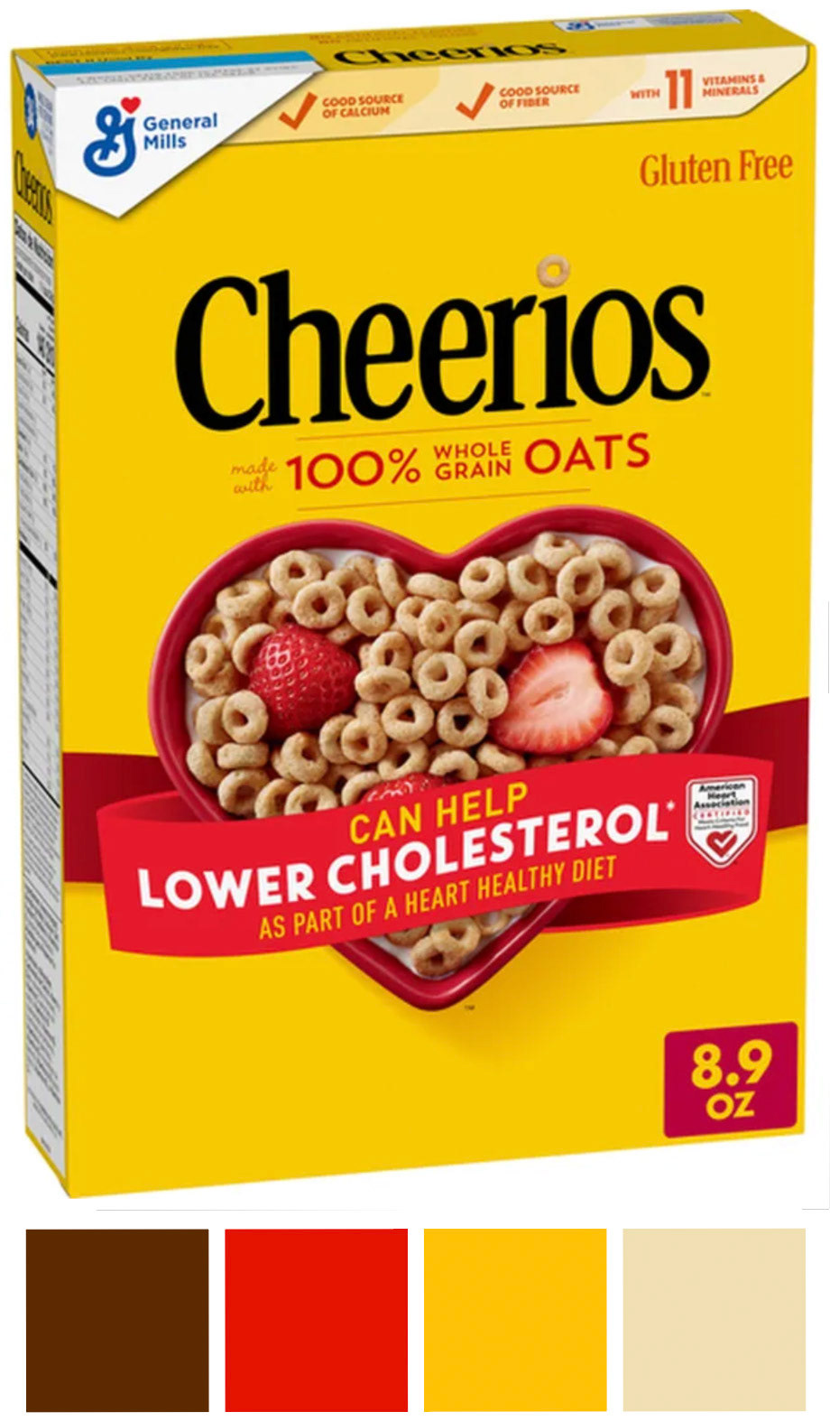
I referenced the packaging design of Cheerios to develop the color palette for this booklet, creating an immediate visual association that I wanted the audience to recognize as “Cheerios” before opening to the first page.

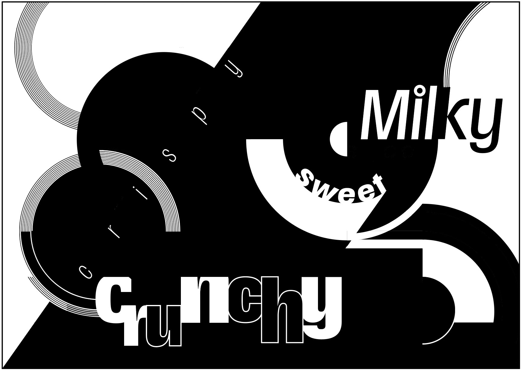
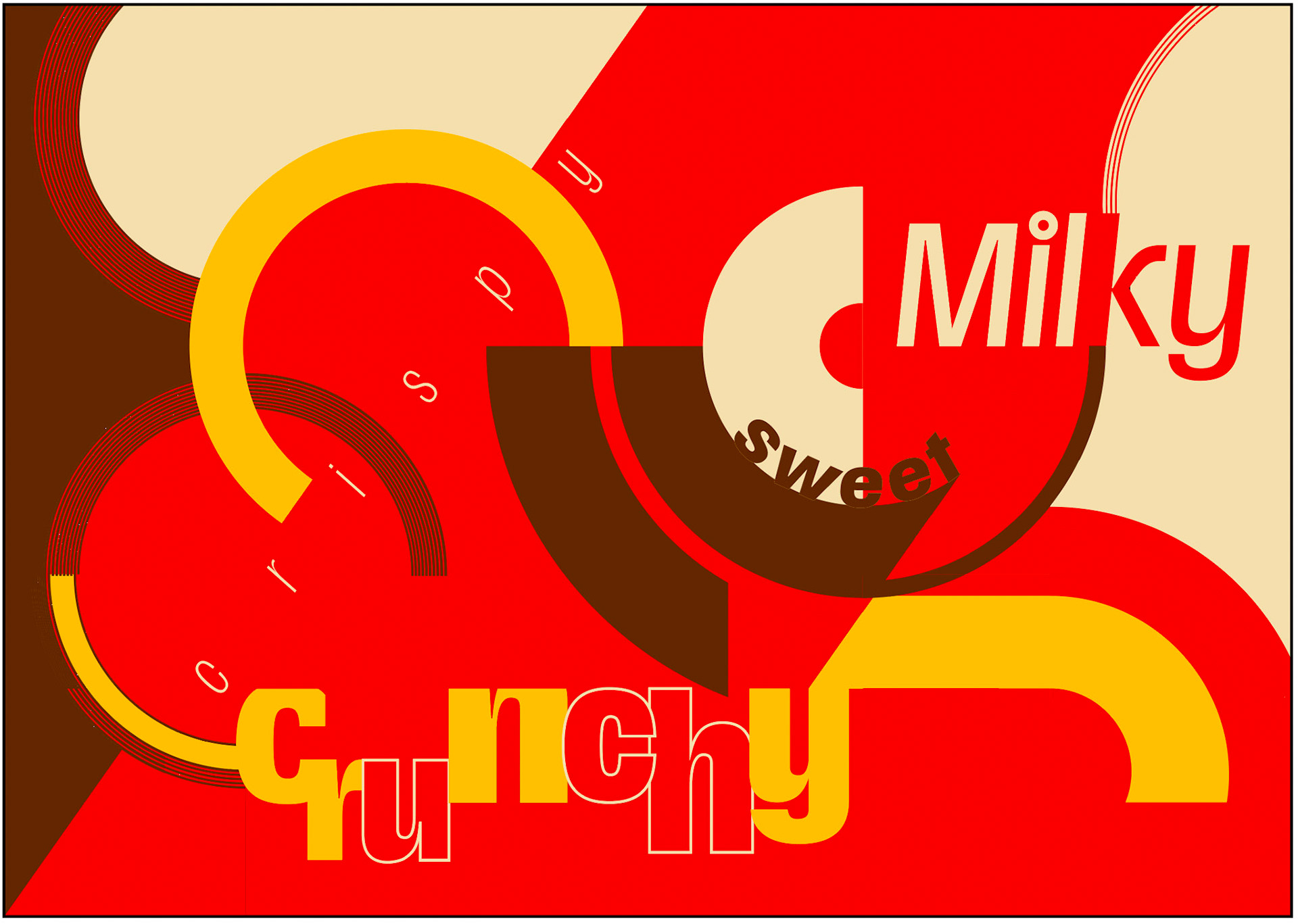
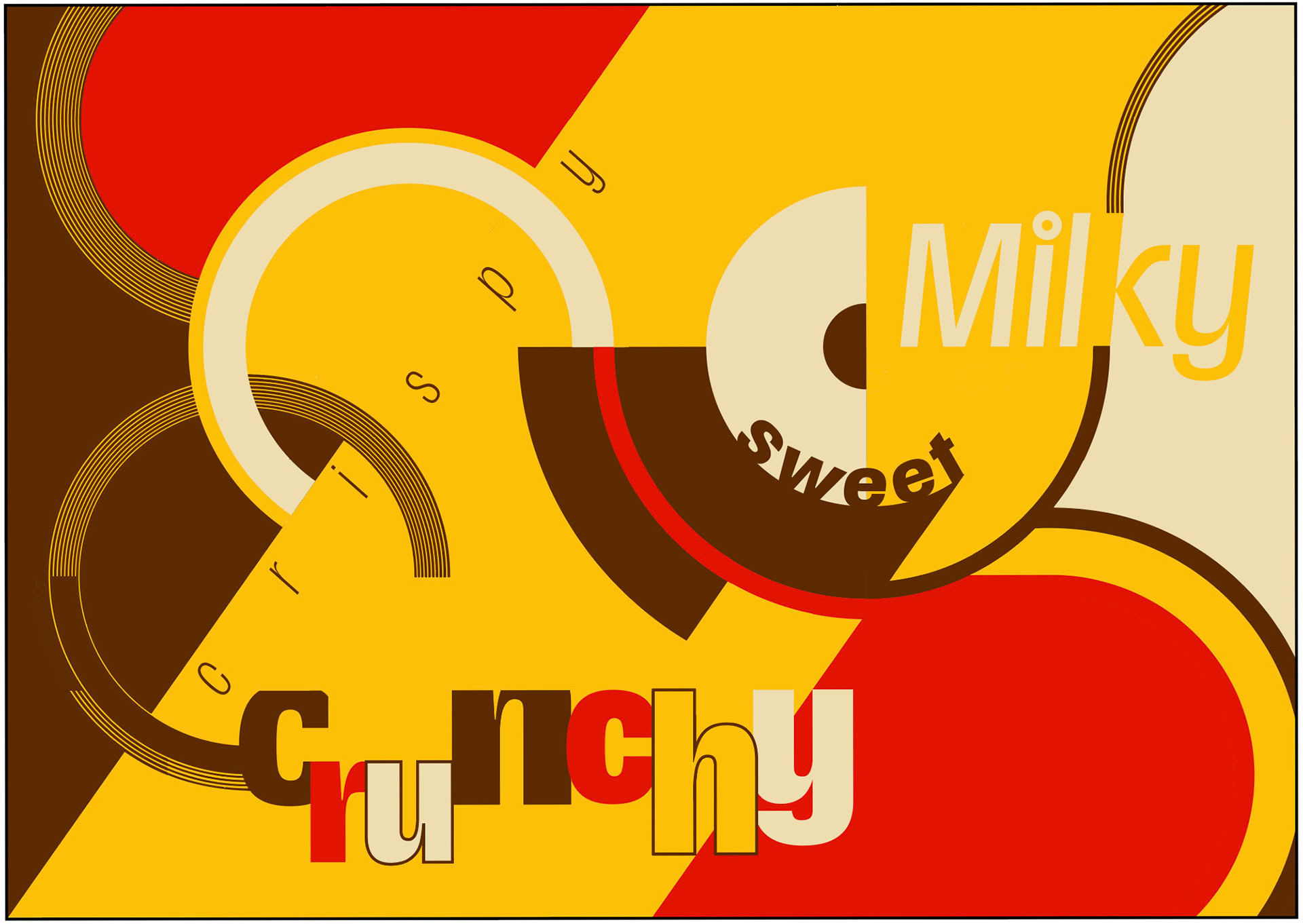
I experimented with overlaying the hues, ultimately deciding that areas containing type should have higher color contrast for legibility. This approach resulted in the final design below.
Final Booklet
