
Objective
Design a mobile Flight Information Display System (FIDS) that organizes complex, real-time airport data into a clear and intuitive visual hierarchy. Use information design, typography, grid systems, and user-centered communication to improve readability, navigation, and decision making for airport passengers.
Research
The User
Hierarchy of information as a passenger:
Departure: gate, scheduled, destination, airline, status, code
Arrivals: time, status, airline, code
Organizing Information "LATCH"
L: Location
A: Alphabetic
T: Time
C: Category
H: Hierarchy
III. Visual
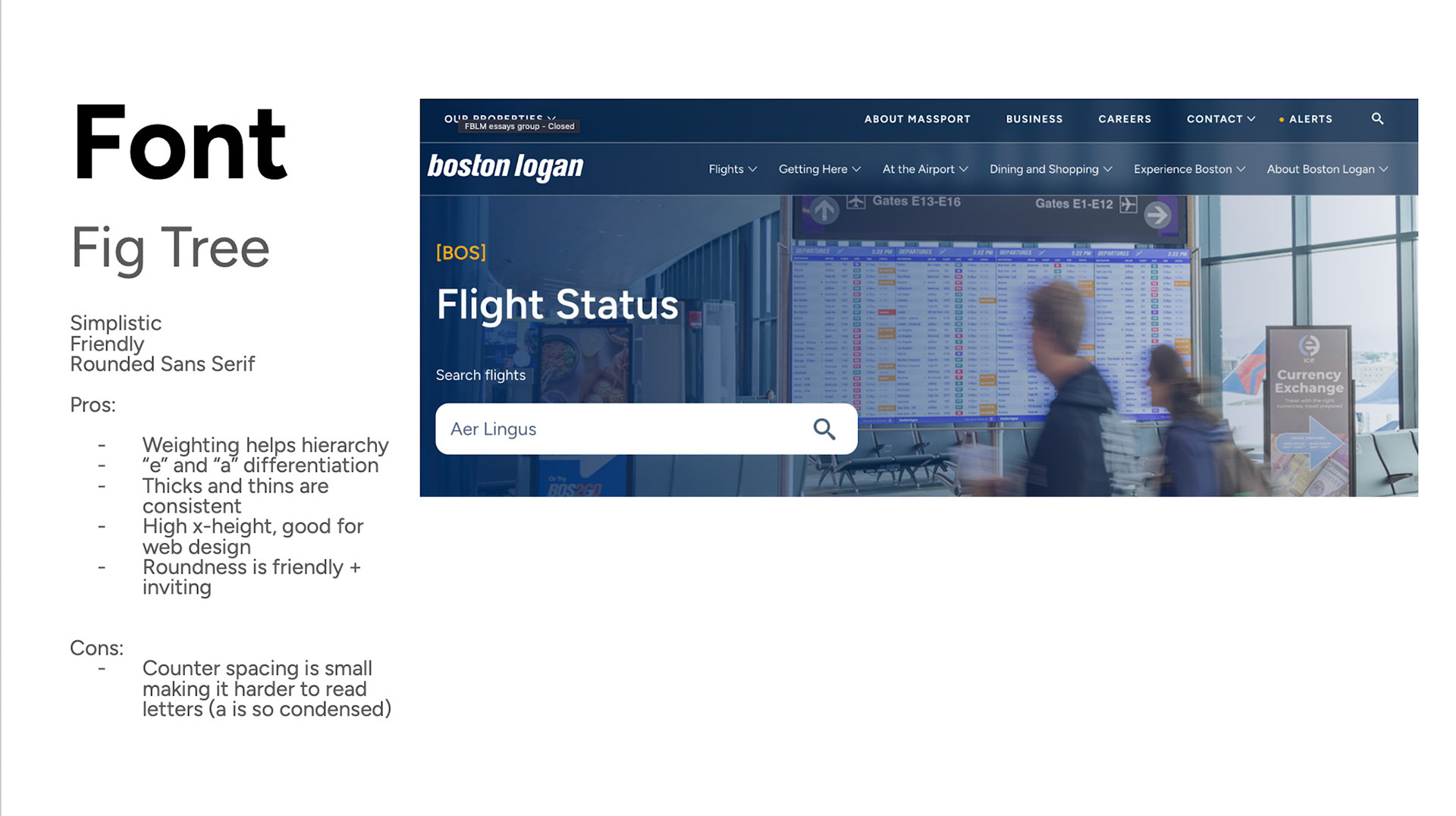
Boston Logan Airport Case Study



Initial Sketches and Ideation
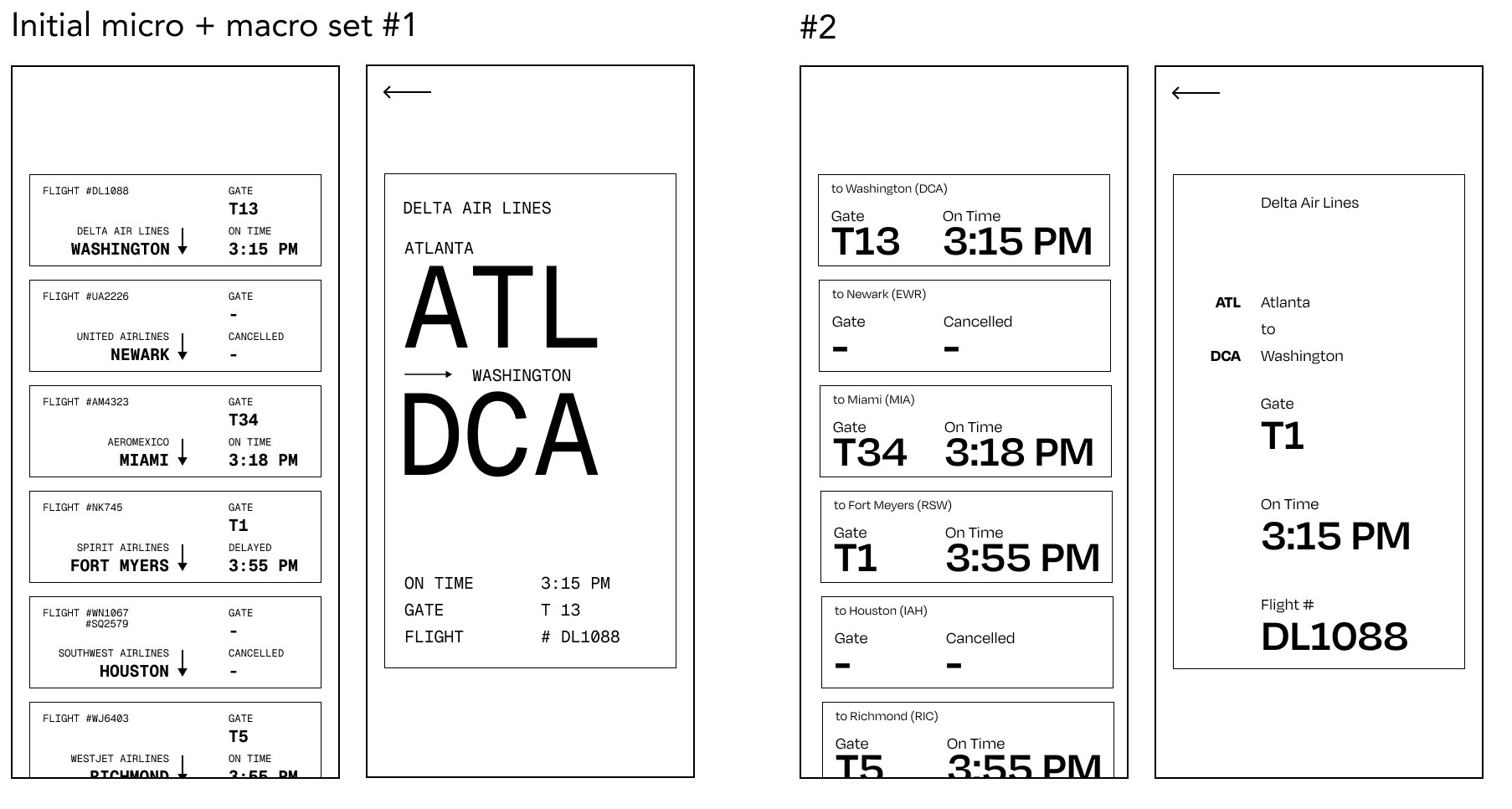
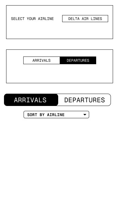
I used my established information hierarchy to develop wireframes, beginning with paper sketches before translating them into digital layouts.


I then developed page layouts from these wireframes, landing on two potential directions that balanced clear information hierarchy with ease of navigation.
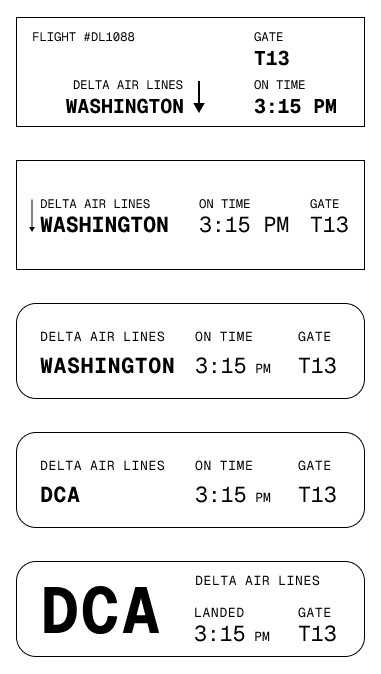
Establishing Typographic Hierarchy
and Readability

Color Exploration
Through research and experimentation, I found that dark text on a light background improves legibility and supports a more accessible user experience.
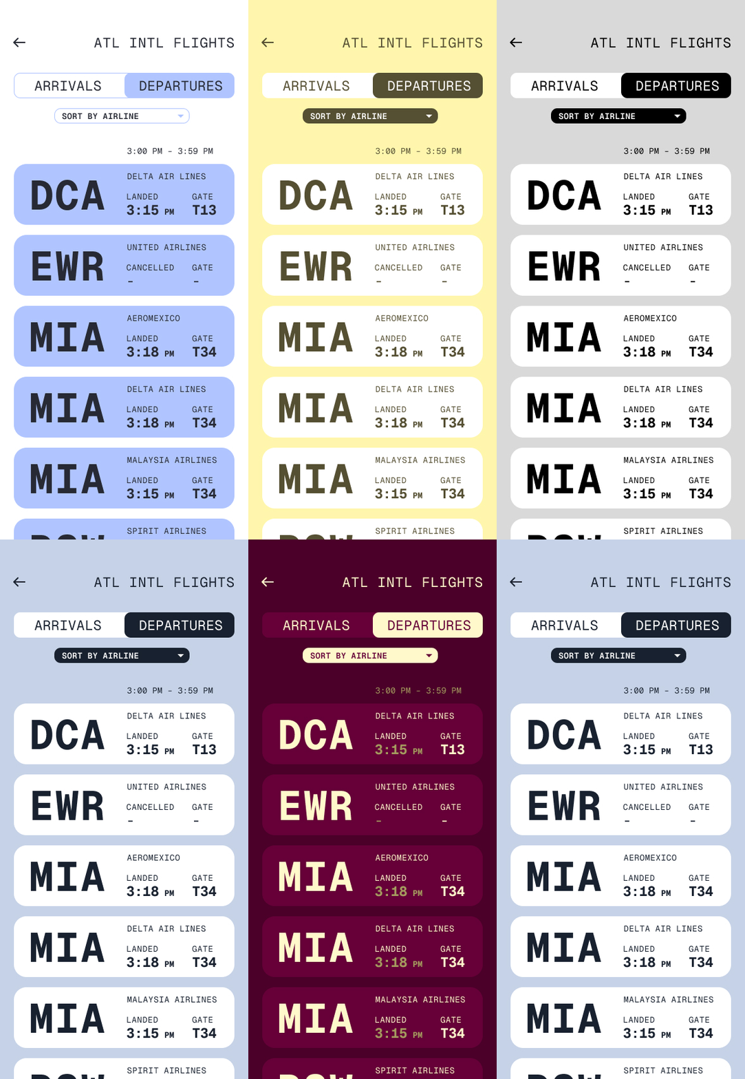
Although “dark mode” remains a popular visual trend, I prioritized clarity and ease of reading. Because this airport app is designed for people of all ages and visual abilities, a lighter palette with dark text became the stronger choice for this project.
Final Color Scheme:

I chose turquoise, black, grey, and white palette to create a clean and calming interface while maintaining strong visual hierarchy. Aqua acts as an accent color to highlight interactive elements and bring character, while black and grey establish clear levels of information. White provides an open background on buttons that improves legibility and allows users to quickly navigate the app.
Final Display
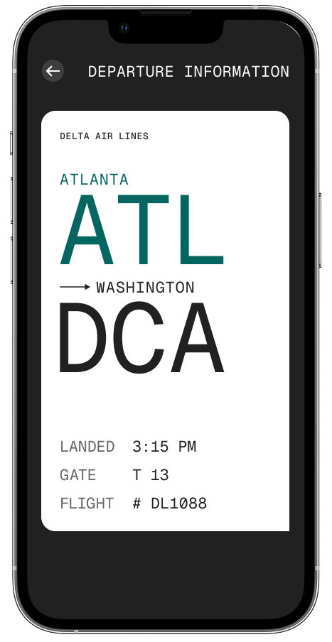
Departures Micro, Sorted and Macro Screen
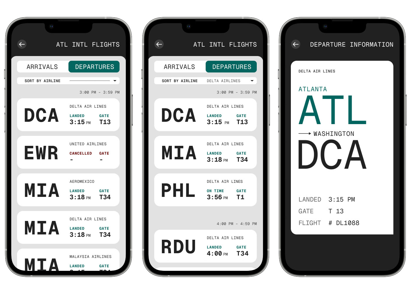
Arrivals Micro, Sorted and Macro Screen

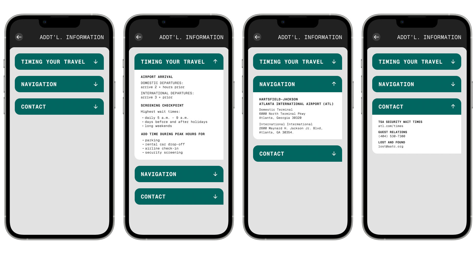
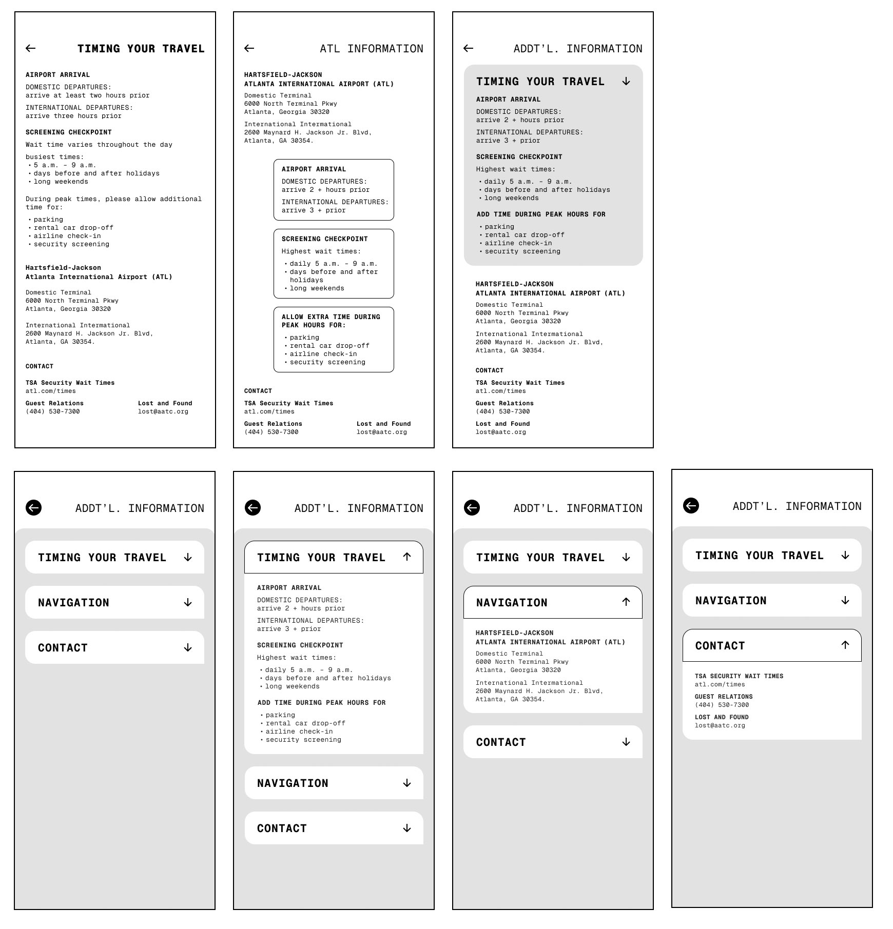
Additional Information Screens