Objective
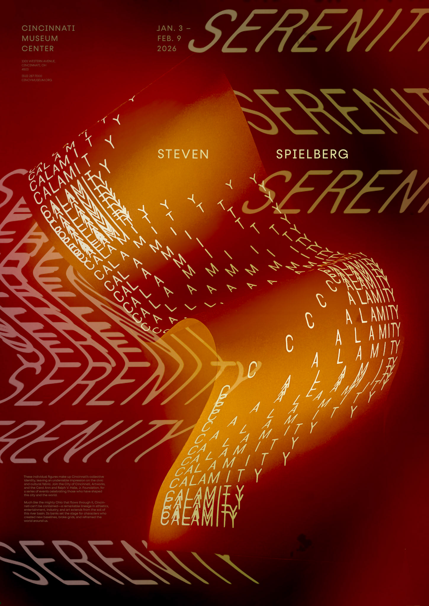
Create a 23.35" x 33" poster which focuses on the manipulation and arrangement of typography to convey a message about filmmaker Steven Spielberg.
Experimentation
Personifying printed words through physical manipulation using experimental photography techniques such as reflective papers, glass, water, slow-shutters.
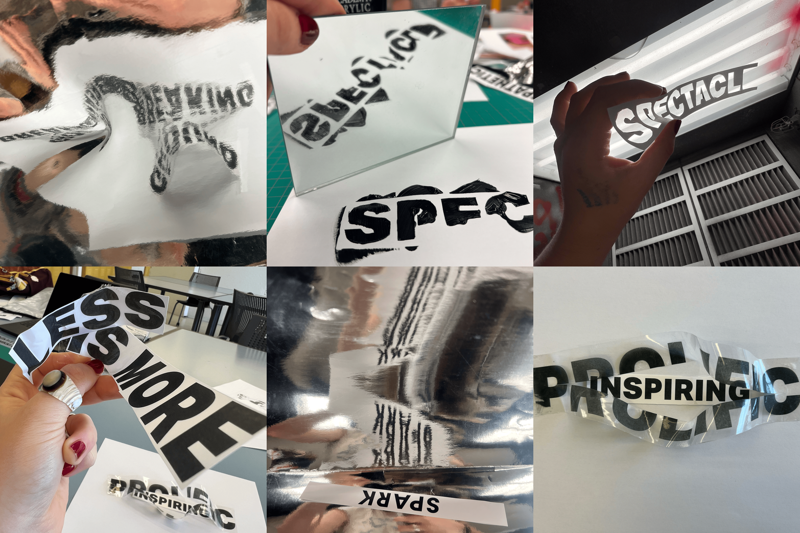
I then isolated 100+ the experimental photographs for semiotic analysis.


Design Concept
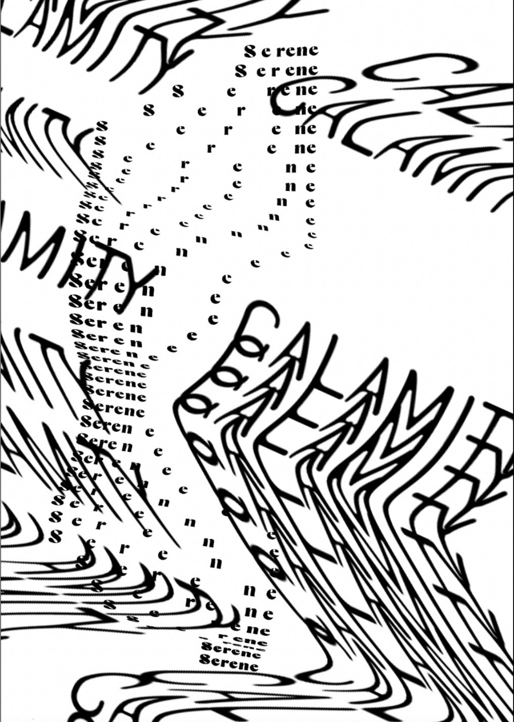
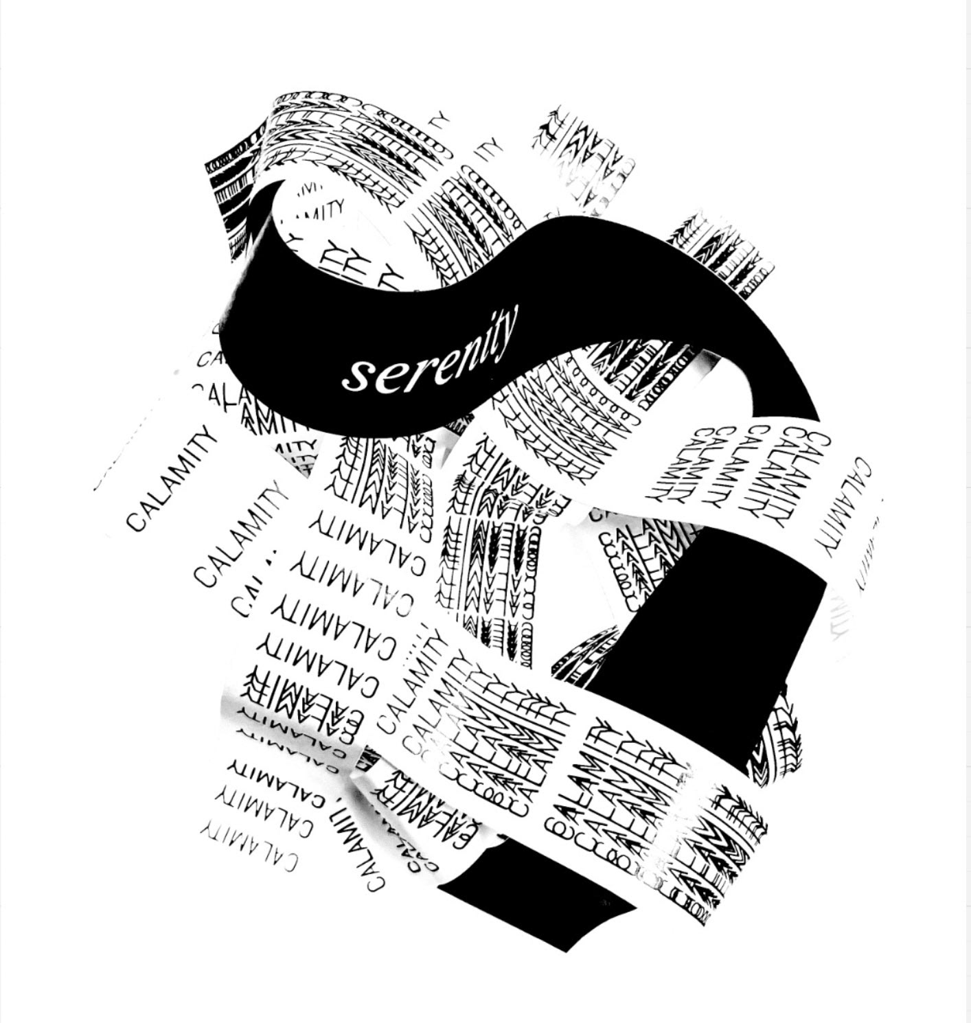
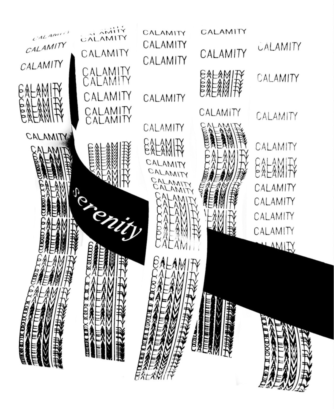
My research of Spielberg revealed two recurring directorial choices: calamity and serenity. Moments of serenity, like Relaxing on the beach in jaws (1975), were directly juxtaposed with moments of calamity, seen when the shark arrives. Spielberg uses dramatic cinematography, scores, and performances, which I set out to portray with type alone. I began experimenting with intertwining the words “calamity” and “serenity” to visually represent this tension using what I learned from the experimentation phase.
Calamity/Serenity Paper Experiments
Paper Experimentation





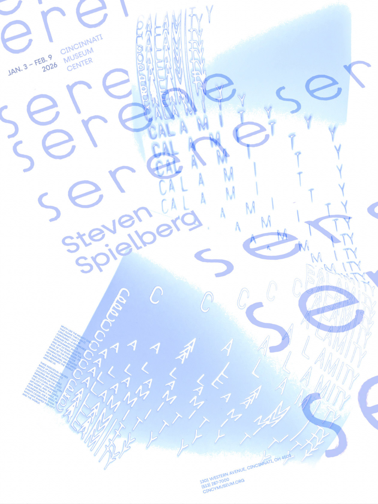
Sampling Layouts and Color Schemes

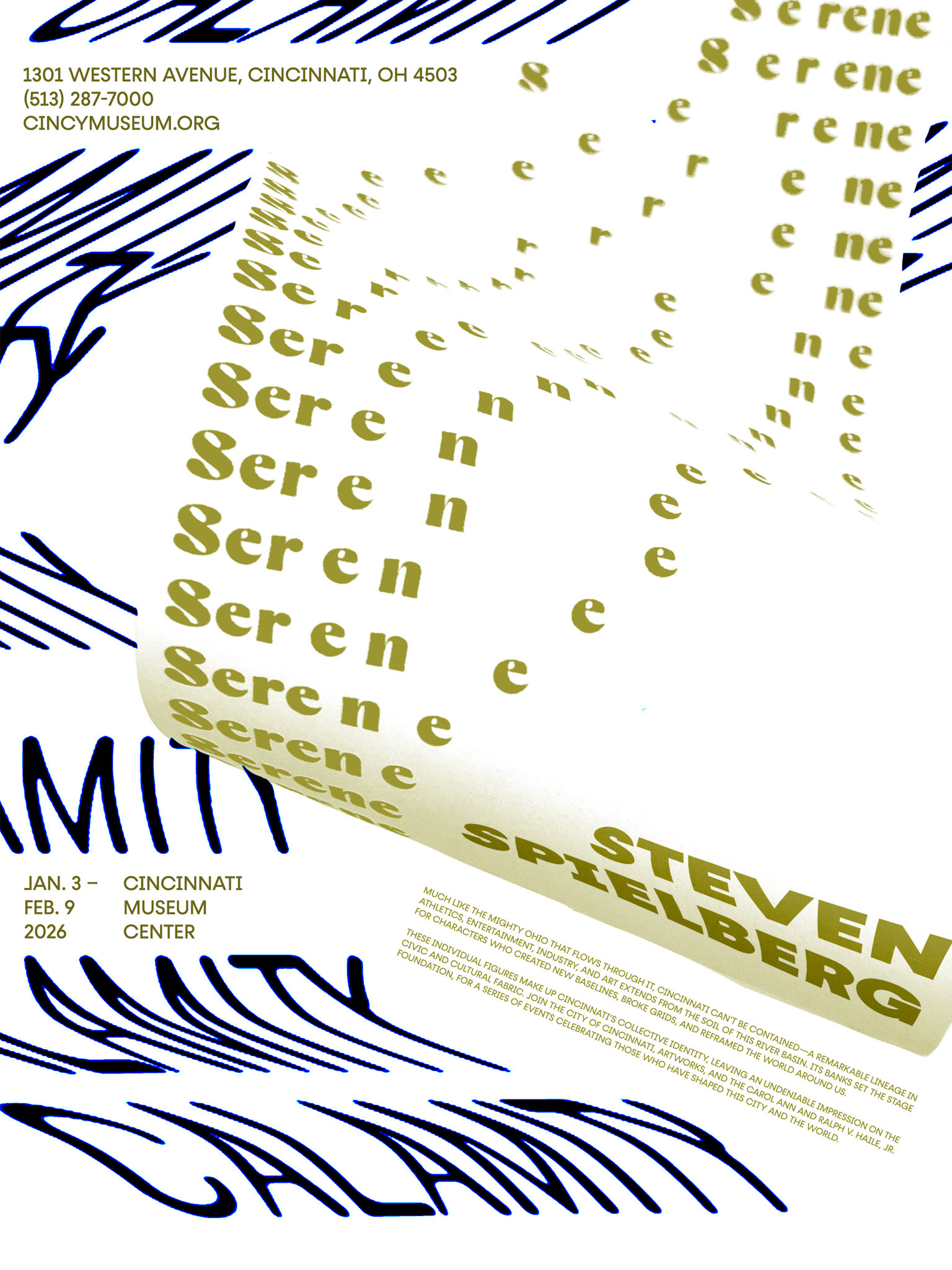


Final Poster
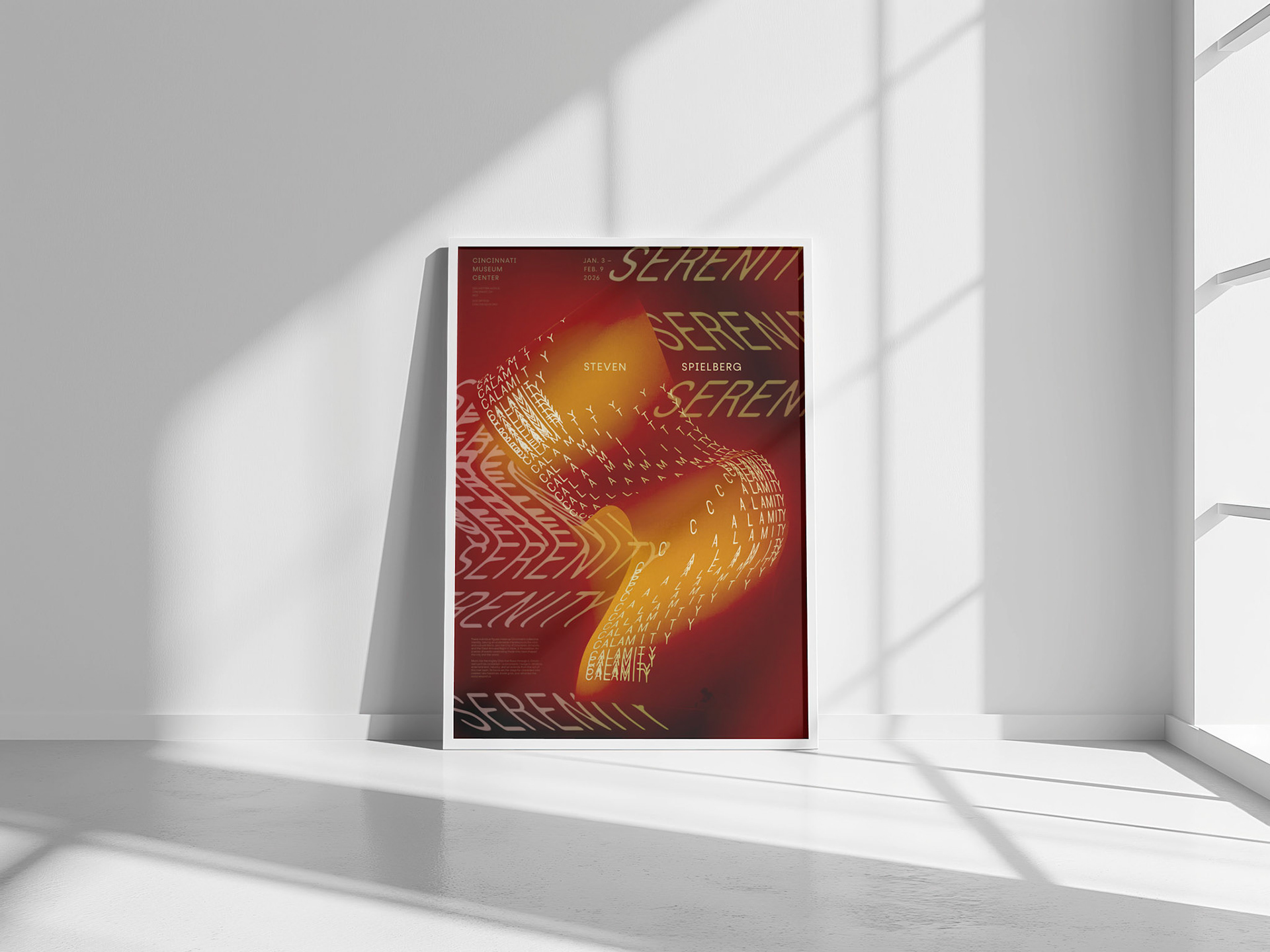
The final design uses burnt-film colors and high contrast to both resemble a strip of film and reflect the dramatic contrast found in Spielberg’s films. “Calamity” is tracked in and out as it repeats to create a sense of organized chaos, while “Serenity” flows freely and expands across the composition, representing the tranquility that surrounds and contrasts the moments of calamity.
(implied viewing scale 23.35" x 33")